Bold Rose Group Identity
date
mar '21 - mar ' 21
role
logo + identity designer
challenge
A sibling owned real estate management company was needed to establish an image that would convey their values, and encourage the community and visitors to feel safe.
solution
Create a bold, trendy yet trust worthy brand identity for Bold Rose Group that evokes a feeling of security, quality, and family.
responsibilities
Competitive audits, research, sketches, and iteration are essential steps that were taken in the design process.
process

background
Being newly formed by three siblings in honor of their late grandmother, Rose, Bold Rose Group began aquiring property that could be used for family vacations in off-season. This exciting venture led to a unique opportunity to provide the highly seasonal residents of the West Palm Beach town while hopefully building a closer family bond.
competitive audit
A competitive audit allowed me to gain insights into the branding strategies of similar real estate and management companies and businesses operating in the same market segment. I found that similar businesses typically use red and black simplistic color palettes and incorporate outdated and ornimental imagery and elements into their logos..
design & refine
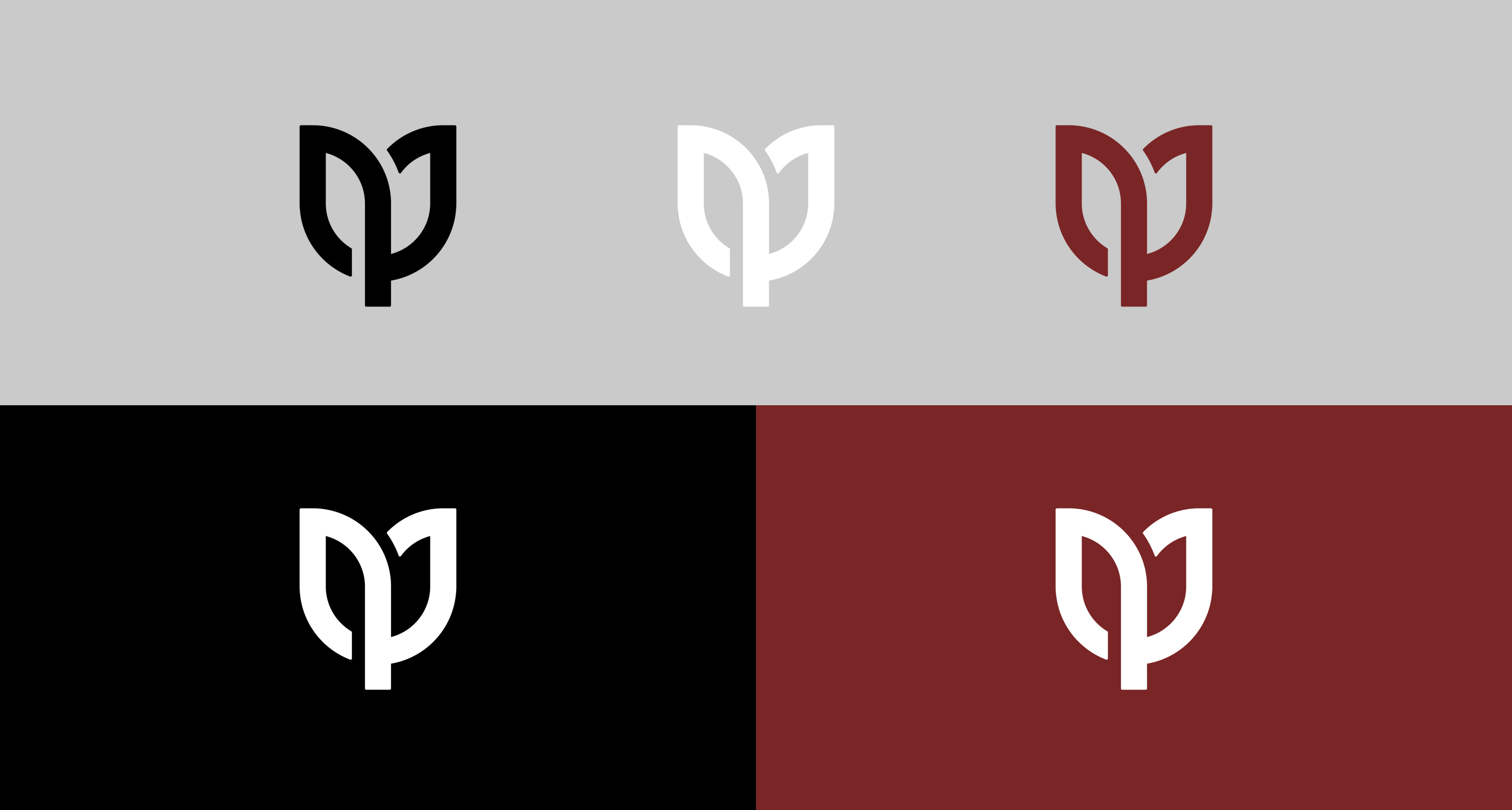
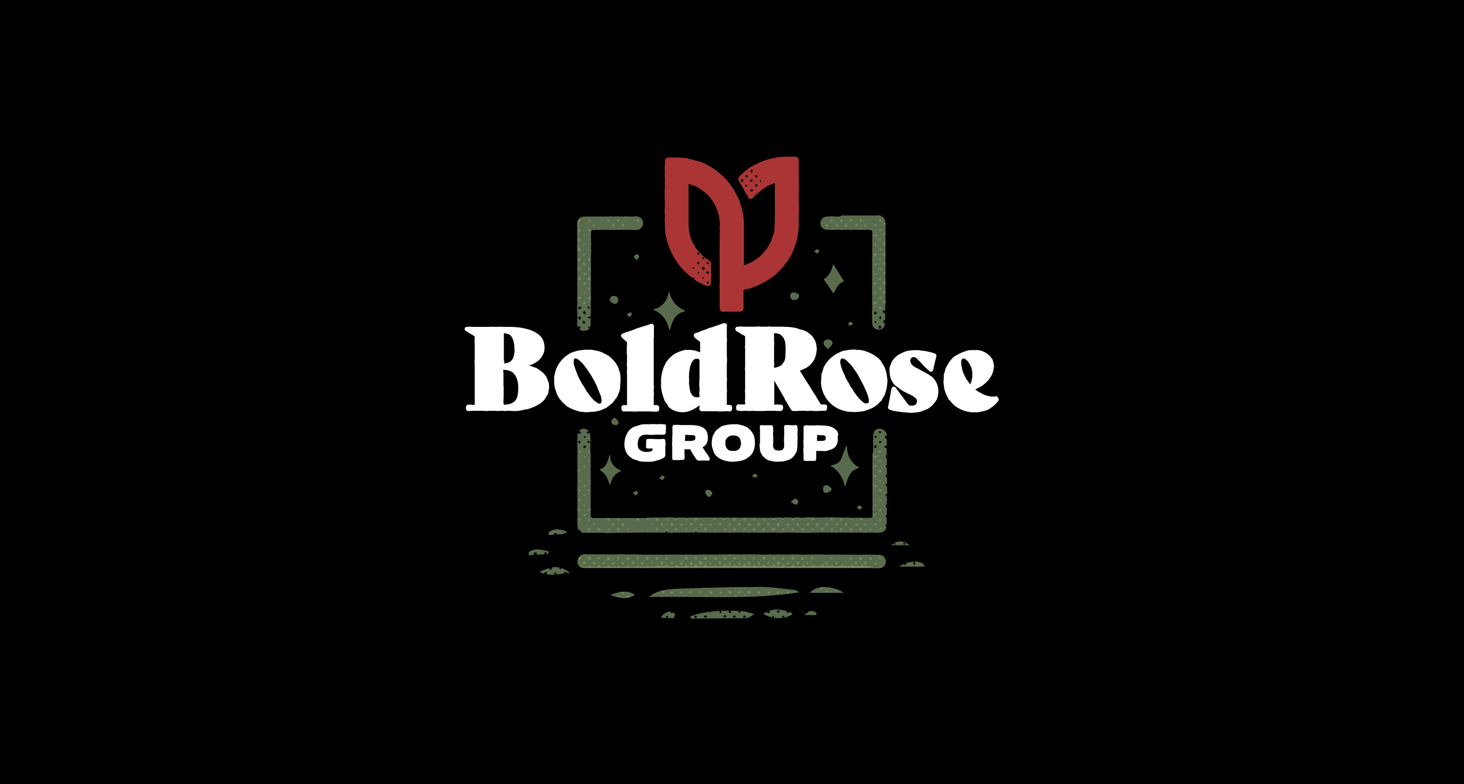
The logomark of a quite litteral bold rose was included as the centerpeice of the logo to honor the owners' grandmother. Similar to their competitors, and fitting for the subject matter, I went with a bold red and black color pallete and accomponying bold and timless serif typeface as the main logotype for the brand. The imagery was crafted to allow it to work well in professional and informal uses.
more projects
