AcutePlus Website & Software
date
Jun '22 - Aug '22
role
UX Designer + Identity Designer
challenge
The AcutePlus team aims to efficiently educate and enroll new members, overcoming their struggles with enthusiasm and professionalism.
solution
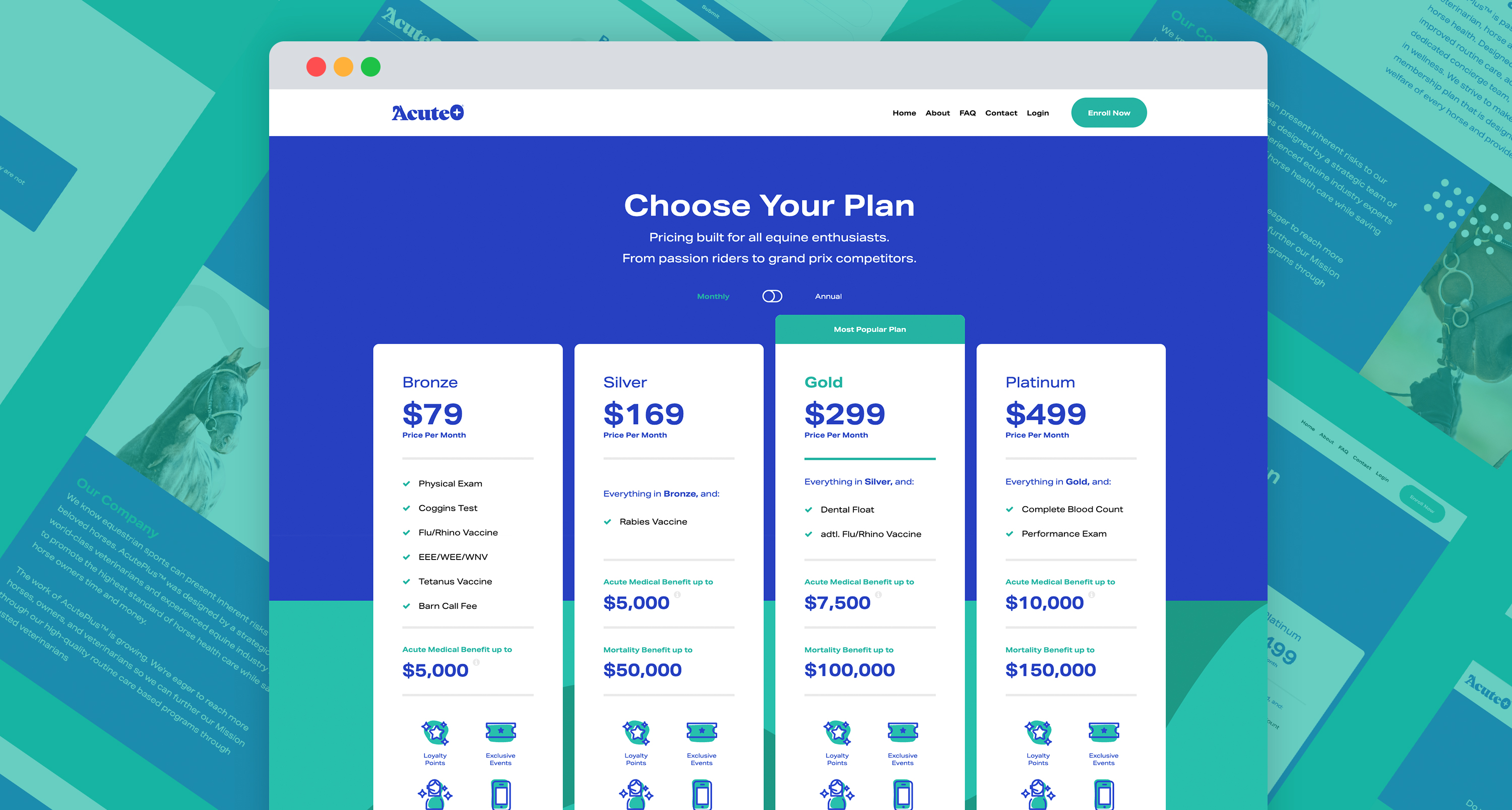
Create a professional website for the AcutePlus team, offering an engaging platform to learn about and sign up for the benefit program.
responsibilities
Interviews, wireframes, prototypes, usability testing, and iteration are essential steps in the design process.
process
ideate & research
Through interviews and empathy maps, I gained insights into the needs of the users I am designing for: traveling equestrians. Research confirmed that an effective user flow or website for educating and enrolling new members was a key requirement. However, it also uncovered additional challenges faced by this user group, such as time constraints, finding horse care, and the need for information on horse protection.
wireframe & prototype
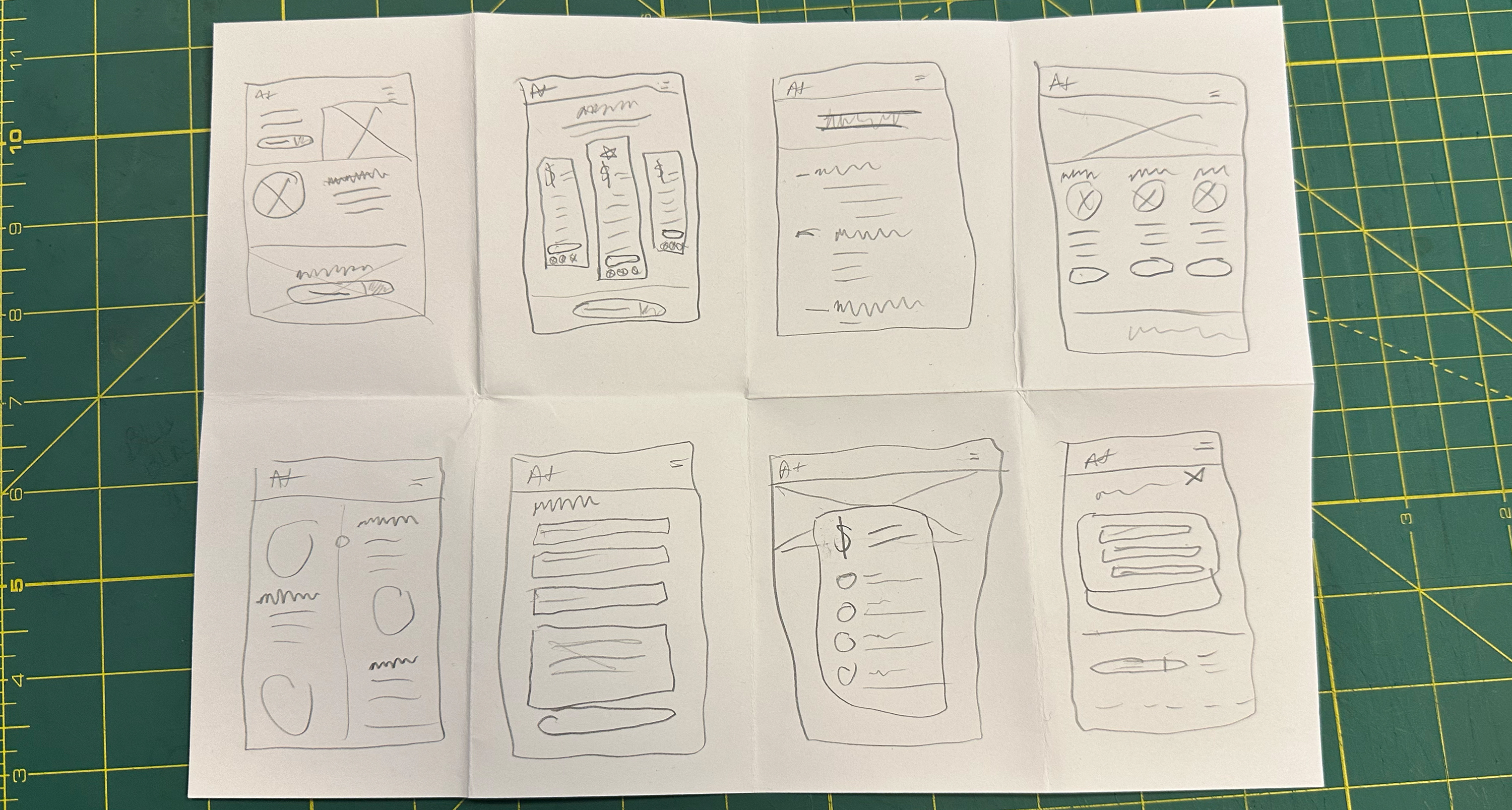
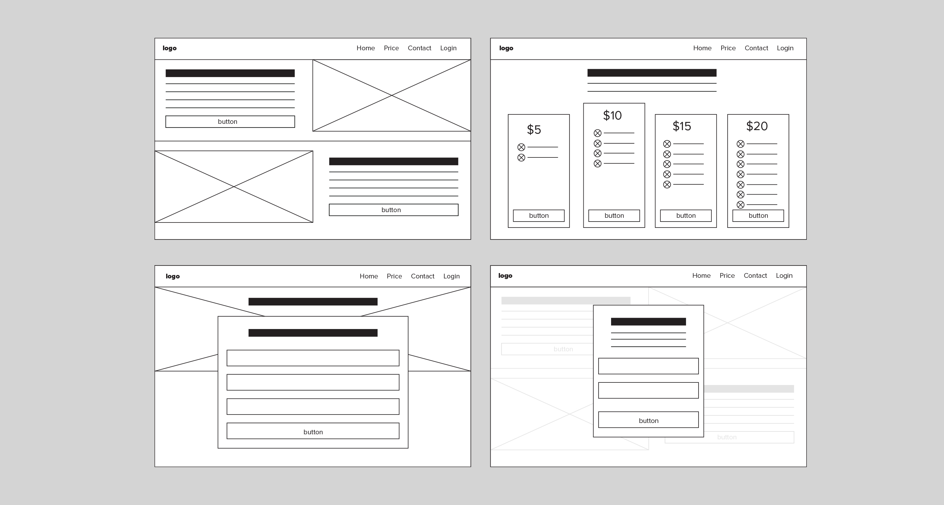
By dedicating time to sketching out different versions of each app screen on paper, I guaranteed that the elements chosen for the digital wireframes would effectively tackle user problems. When it came to the pricing page, I focused on using straightforward pricing cards to showcase the key advantages. Additionally, throughout the initial design phase, I consistently incorporated user research feedback and insights into the designs.
design & refine
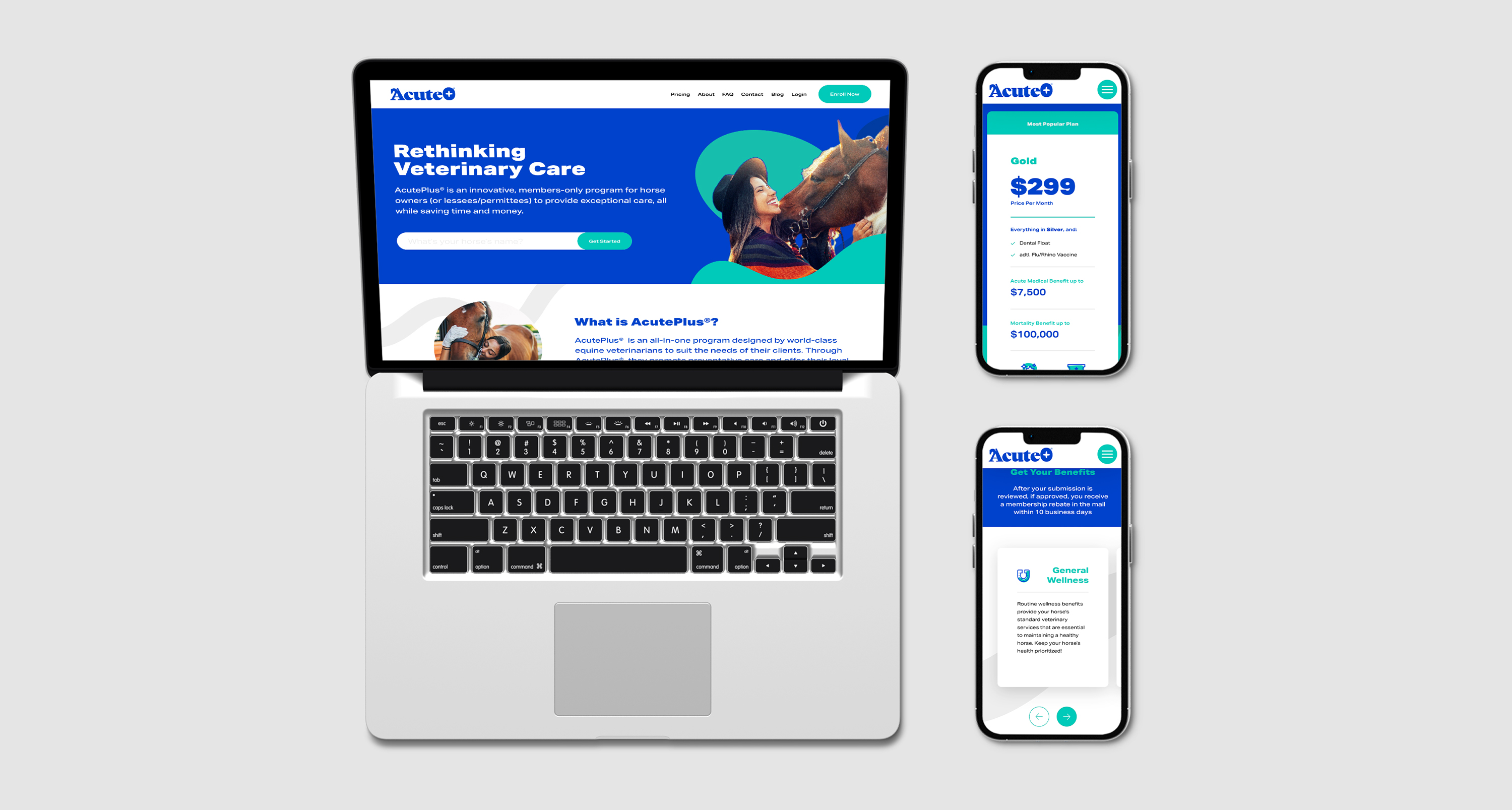
Through usability studies, I made improvements to the initial designs by incorporating icons for better accessibility comprehension. I also refined the design to prioritize relevant information upfront for users when they visit the website. The final high-fidelity prototype showcased enhanced user flows for reviewing program benefits and catered to the accessibility requirements of users.
more projects
